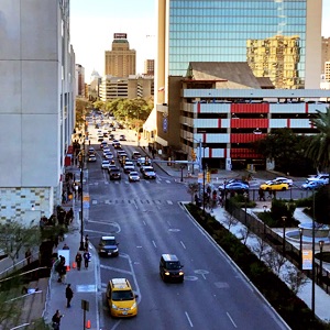
Graphic Designers in San Antonio, Texas

Graphic Designers in San Antonio, Texas

Looking for Graphic Designers in San Antonio?

Your search for “Graphic Designers in San Antonio” should start here, with me, Thomas McAuley, your graphic design and advertising/marketing partner.

With years of experience translating complex ideas in to easy-to-understand, eye-catching, and appropriate products, both as the lead designer and behind the wheel as art director, communicating with C-Level contacts and multi-functional team members alike, I am a valuable addition to your marketing strategy implementation.

I do it all.

Corporate Branding & Corporate Identity, Website Design & SEO, UX/UI Design & Prototyping, Print & Digital Graphic Design, Social Media Design. PLUS, as an art director, I am positioned to be just the right art director to help your organization get project goals defined and produced, on time and on budget.

Graphic design for the healthcare industry

With our enormous medical center in our northwest and with multiple military installations in and around our periphery, San Antonio is one of the most important healthcare hubs in the nation.

That fact dovetails well with my own graphic design experience. If you haven’t already noticed, you’ll see that my graphic design portfolios are overwhelmingly filled with examples from the healthcare industry or peripheral to it. Since 2012, I have been working as a plugin graphic design company for marketing company, Punching Nun Group, adding full graphical support to their long list of marketing-related services they provide to multiple healthcare companies across the country. During this long partnership, I have become something of a corporate identity design expert, doggedly defending brand at every step of the design process. You could do worse than rely on me for healthcare-centric design.

If you don’t see it? Ask.

I invite you to look through my many work portfolios below. If you don’t see the type of work you’re looking for, don’t doubt: it’s very likely I do that too and have not gotten to creating a unique portfolio page for it.


CONTACT ME

Graphic Design Portfolio & Services

Stationery Set Design: Odyssey Design Studios

Digital Design
and Video Production

Website Design: Venture Founders

Website Design,
UX/UI and SEO

White Paper Design: Chess Health

Corporate Identity,
Branding, and Rebranding

Infographics Design: Updox

Print Collateral
Graphic Design

White Space Is A Beautiful Thing

White Space Is A Beautiful Thing

What IS White Space?

Blog Hero: Puppy and Chick: Bad Design and Bad Design Experiences

Simply put, white space is an empty area surrounding a design element. And don’t be mislead by “white” and “empty” because the design element isn’t always surrounded by a field of pristine white, but possibly a texture like grass or sky or some other regular background. But the effect is that in relation to the featured design element, the area around it is empty. “White space” is simply a convenient term.

Why Is White Space a “Beautiful Thing”?

Now you know WHAT it is, WHY is it? And what makes it a “beautiful thing”? To understand why designers have relied on white space since the beginning of Design, one must understand its effect on a viewer.

Because we’re basically animals, when any of us with normal, healthy vision looks at a designed piece, they generally see elements in a predictable order:

  • Faces
  • Color
  • Symbols
  • Edges
  • Text

You can imaging how difficult things could get for a designer if this order were set in stone. Fortunately, we have work-arounds and among the most powerful of them is white space.

There’s one thing I left off the list above because it’s not really a thing, but the phenomenon of comparison. You see, more than any specific type of element, humans pick on differences more strongly than about anything else. Our eye shoots right to the piece of spinach between the boss’s teeth. We can’t NOT see the one out-of-step solider. We notice the child among adults at the business meeting. And it seems there is no turning off command of our focus.

And that’s where the magic of white space finally comes into play. If you need the text to be seen before or more prominently than, say, the model who is speaking, leverage white space in two directions:

  • Framing. By placing the element of focus—the text, in this case—in a semi-central location in the design and by giving it a lot of room on all sides, we see it as special or important.
  • Diminishing. Conversely, by removing white space from around a design elements that might otherwise steal attention, we communicate to a viewer that the element is less consequential.

Of course there are better and worse ways to utilize the concept of white space but at its root, it really is that simple.

A blunt but successful example of using white space is how we always see “Got Milk” campaign or the Nike swoosh presented, by themselves and with ample space around them. But an experienced designer will consider white space in every aspect of design. The spacing between headlines and paragraphs, the tightness of lines in the title of a book, or how much space there is between elements of a business card are all examples of how white space is a conscious decision a seasoned professional makes at every point of design.

It is often the single most notable difference between design work that a viewer will subconsciously categorize as “pro” versus “amateur”.


CONTACT US