When many people think of logo design, they think aesthetics are the prime goal. It makes sense. After all logo design is what gets many designers’ blood pumping. In fact, it’s one of the most common reasons designers cite for getting them interested in design in the first place. But like all other areas of design, the real key to creating a successful and, yes, aesthetically appealing logo capturing a company’s essence and values in a single visual. And that starts with (drumroll) Understanding, a common theme on this site, you’ll find.
To get there, I started with a series of key questions:
What personality did they want their brand to convey?
Did they view themselves as serious, light-hearted, or somewhere in between?
What made them unique in their field?
Were there any strong preferences for or against particular shapes, colors, or styles?
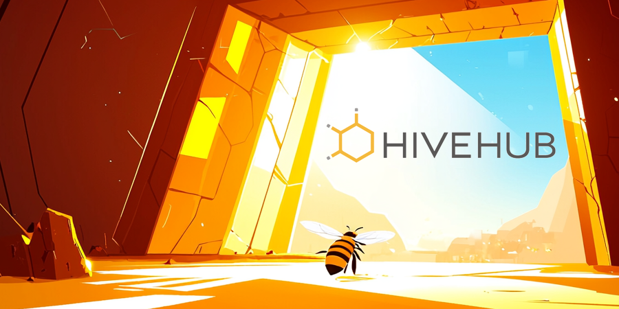
The answers painted a clear picture: HiveHub wanted to communicate confidence, technical expertise, and creativity while maintaining an approachable and slightly light-hearted tone. They also wanted their logo to emphasize their role as a central hub for innovative digital solutions.
The design process
The logo mark
For HiveHub, the name itself sparked immediate inspiration. The hexagonal structure of a beehive felt like an obvious starting point, but I knew I needed to push beyond the cliché. The hex shape was a natural symbol of structure and connectivity, but I wanted to give it a unique twist to reflect their identity.
From the outset, I visualized incorporating the concept of a hub, extending elements from the hexagon to represent the company’s role as a central point of innovation. I sketched three concepts: one highly stylized, one slightly abstract, and one straightforward. To my surprise, they opted for the simplest design. In hindsight, their choice perfectly aligned with their brand’s straightforward confidence.
Color choice
The color palette was an easy decision. A honey-inspired golden hue was essential to maintain the integrity of the hive metaphor while still feeling modern and professional. While this choice carried a slight risk of being overly literal, it was the best way to ensure the logo’s meaning was immediately clear.
Colors have distinct connotations across industries, and subtle shifts could easily change the logo’s interpretation:
Blue: Healthcare or technology
Gray: Networking or infrastructure
Green: Environmental or chemical themes
Pink: Toys or playful branding
While those colors might work for other industries, the golden hue worked perfectly to convey HiveHub’s balance of sophistication and warmth.
Typography experimentation
Typography is often the unsung hero of logo design. For HiveHub, I initially experimented with integrating hexagonal shapes into the text itself. For example, I tried mirroring the “V” in “Hive” to create a hexagonal element. None of these attempts felt cohesive or balanced.
Eventually, I landed on the clean and versatile Brother 1816, tweaking the letter spacing to harmonize with the logo mark. After several iterations, I subtly adjusted the width of the “V” to balance the design visually. The result was clean, modern, and complementary to the logo mark.
The finished logo
The final HiveHub logo came together with remarkable clarity. The directness of its design reflects the company’s mission: a central hub for creativity, collaboration, and innovation in game and app development.
What this project taught me
Every design project is an opportunity to learn. Even after as many corporate identities as I had created, the HiveHub branding project again reinforced the importance of listening to clients and staying open to their input, even when it challenges your initial vision. While I originally envisioned a more complex design, the simplicity of the final logo proved that sometimes less is more when it comes to corporate identity.
HiveHub’s logo exemplifies how design can be a strategic tool, not just an aesthetic exercise. By aligning visuals with a brand’s goals and values, designers can create something that resonates with both clients and audiences alike.
Trust me with your brand
Whether you’re building a new company from the ground up or refreshing your current identity, I bring the same level of care and consideration to every project. HiveHub’s journey is just one example of how thoughtful design can transform ideas into impactful visual identities.
Your corporate logo is your company’s first impression to prospective clients and customers. First impressions are hard to overcome, and most of the time you won’t be there to try.
It is crucial that a seasoned pro with tons of branding experience leads you through the process. And that’s where I come in.
With more than 60 companies of all sizes branded and rebranded from the corporate logo design to everything that comes afterwards, you can trust that I know the pitfalls and opportunities presented in this very important time in a company’s evolution.
Contents
EVALUATING YOUR CURRENT CORPORATE LOGO
The first step is to detach as much as possible from any personal feelings or other connections you may have with your current corporate logo design, to look at it with new eyes, to look at it as much as possible like your clients and customers will be looking at it. If you’re unable to, try to ask a handful of strangers, people who don’t know you or the company, what their impressions are of the company that this logo represetnts.
Don’t lead them. Ask them things like, “How big do you think this company is?” “How long do you think this company has been in business?” “Is this a foreign or a domestic company?” “What business do you think this company is in?” and “Is this company still in business?” Some or all of their answers might shock you. Just try to go in expecting the worst, because most company logos can use improvement. You’re not alone.
Not all of the logos below in my design portfolio tell specifically what each business does, but all of them tell a client or customer that there is a certain level of sophistication. They all impart a clear mood or tone of the company’s business. They all indicate that the companies are probably current, not decades old. And they all communicate a certain proficiency and confidence in what they do.
So now you’ve either seen it or seen it through strangers’ eyes and you understand it’s time for a change. But how can you transition your company into the next phase without that logo that’s meant so much to you?
Maybe you scratched it out on a napkin during a special, inspired moment when you were first starting out. Maybe your favorite niece was an artists and you were proud to let her create it. Maybe initially you didn’t have any money to do it right. Whatever the reason, you owe it to yourself to hold that old logo in your memory, but to move on. You, your employees, and your company’s success depends on it more than you can imagine.
YOUR CORPORATE LOGO’S REACH
In addition to being your company’s first impression, your corporate logo design has a wider reach than you might imagine.
Every design decision you will every make for your company, must relate in some way to the corporate logo, from the color of your trade show booth, to the orientation of your logo on vertical banners, how small it can appear at low resolution. It informs what your business cards look like, your sales sheets, your brick and mortar signage, your website, your app, your company vehicles, and a never-ending continuing list.
Additionally, your new corporate logo has the power to create whatever image in your clients’ or customers’ minds. If you’re a 10-person shop, an improved corporate logo can suggest that you could be a 100-person operation. What I try to do when creating a corporate logo is identify what the perfect business in your area of expertise would look like, what tone they would set, what reaction they are trying to elicit, and work from there.
Now Is Always time to evaluate your CORPORATE LOGO
So again, decouple your emotions from your current corporate logo. I’ll help you right your ship, using the wisdom and guidance I’ve gained over my years as a a professional designer who has done this hugely important work successfully dozens of times before.
You’ve clicked on a portfolio that I haven’t gotten to. Not to worry. Chances are, I do that, too.
With decades of design experience across a huge array of industries and projects, there’s little I haven’t touched. Chances are that I can do whatever you need and/or coordinate with others to get it done.
So maybe it was good luck you arrived here because if you give me something I haven’t already done, it’ll be your work featured in the newest portfolio!
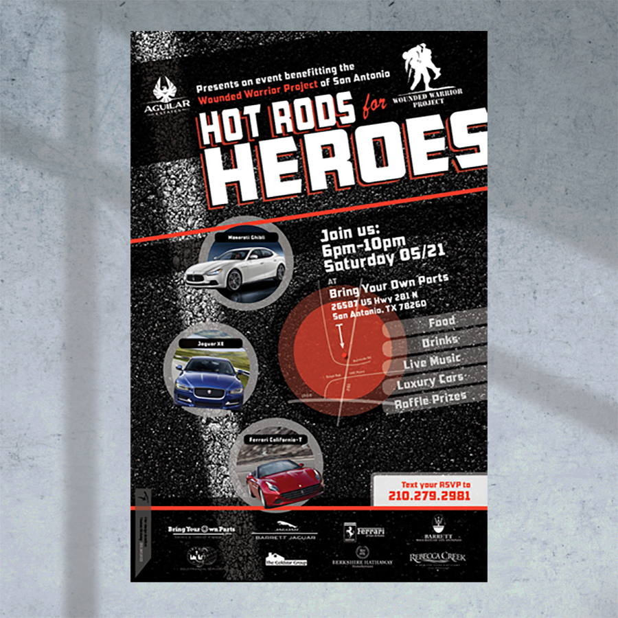
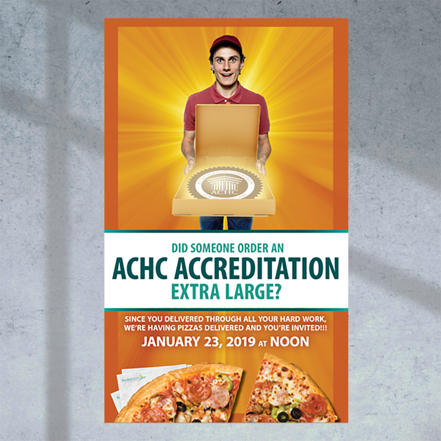
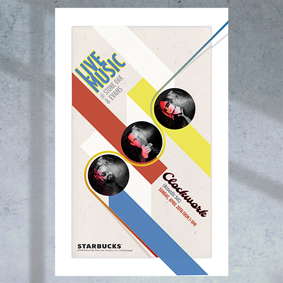
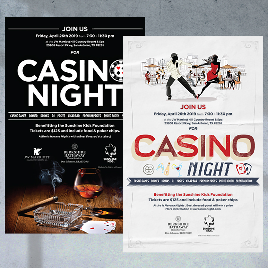
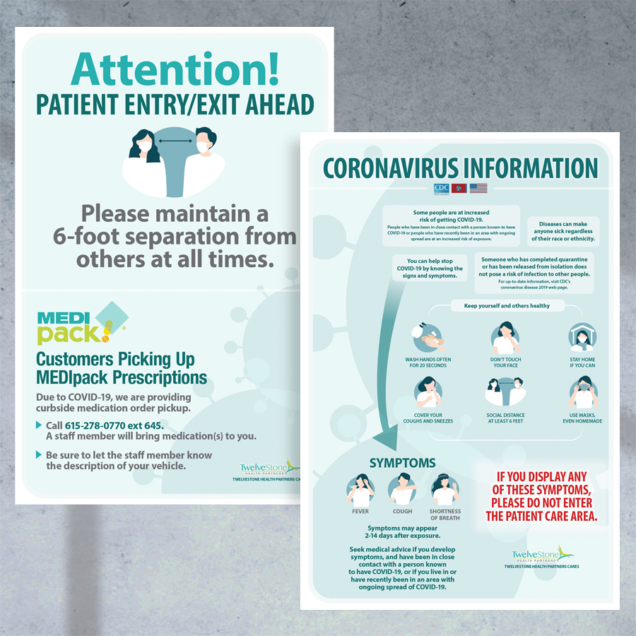
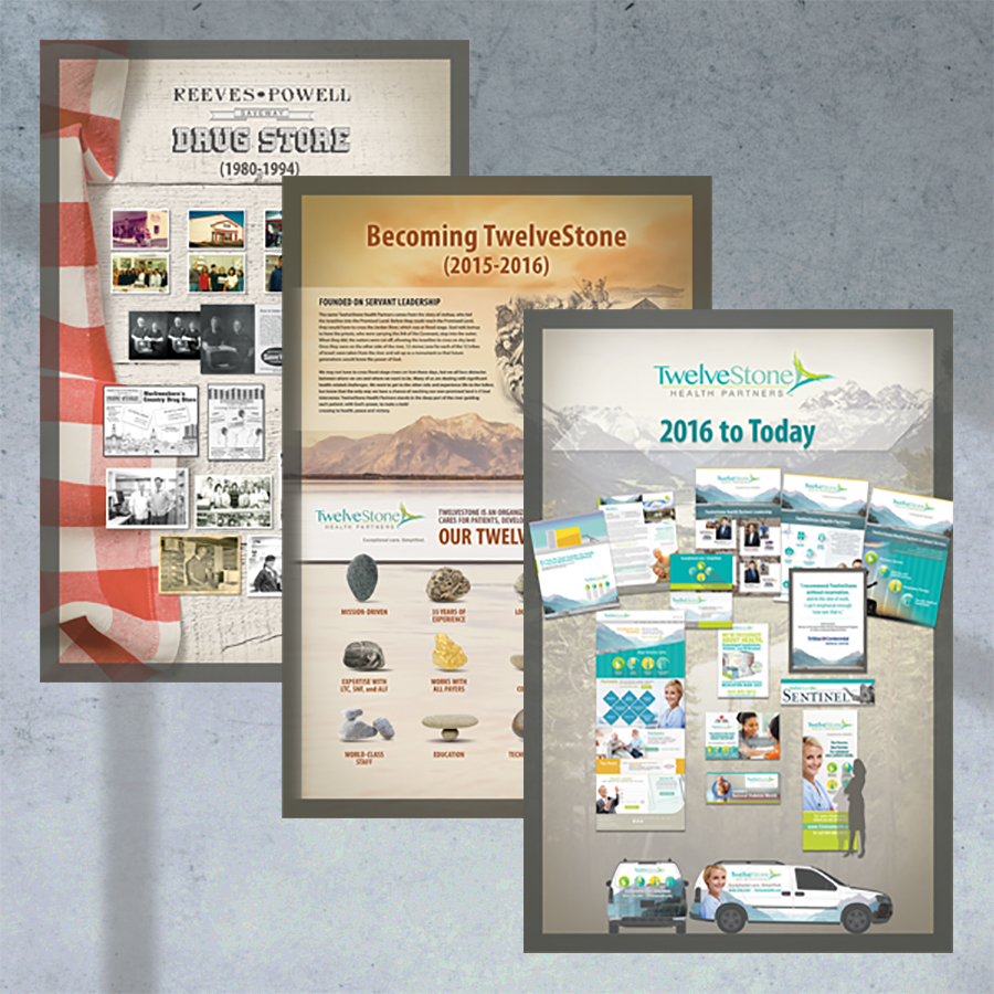
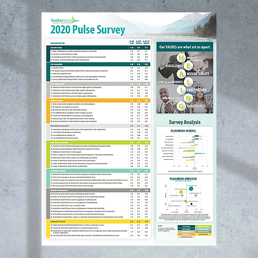
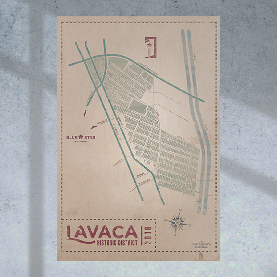
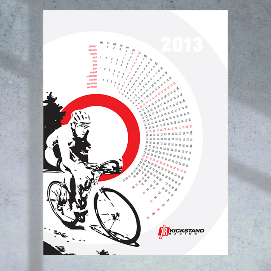
Posters are big, colorful, attention-grabbing and relatively inexpensive to product. However, the particulars of their design and production present unique challenges best left to a professional.
Regarding design, amateurs or less-experienced designers are frequently tempted to fill a poster corner-to-corner with text and images until the viewer’s eye is has no clear starting point or natural flow.
Regarding production, due to their size, posters often require special printing vendors, paper stock, mounting, and framing.
Since posters are such a good value-for-effect proposition, let me handle the design, production, and delivery of your posters to ensure optimal quality and effect.
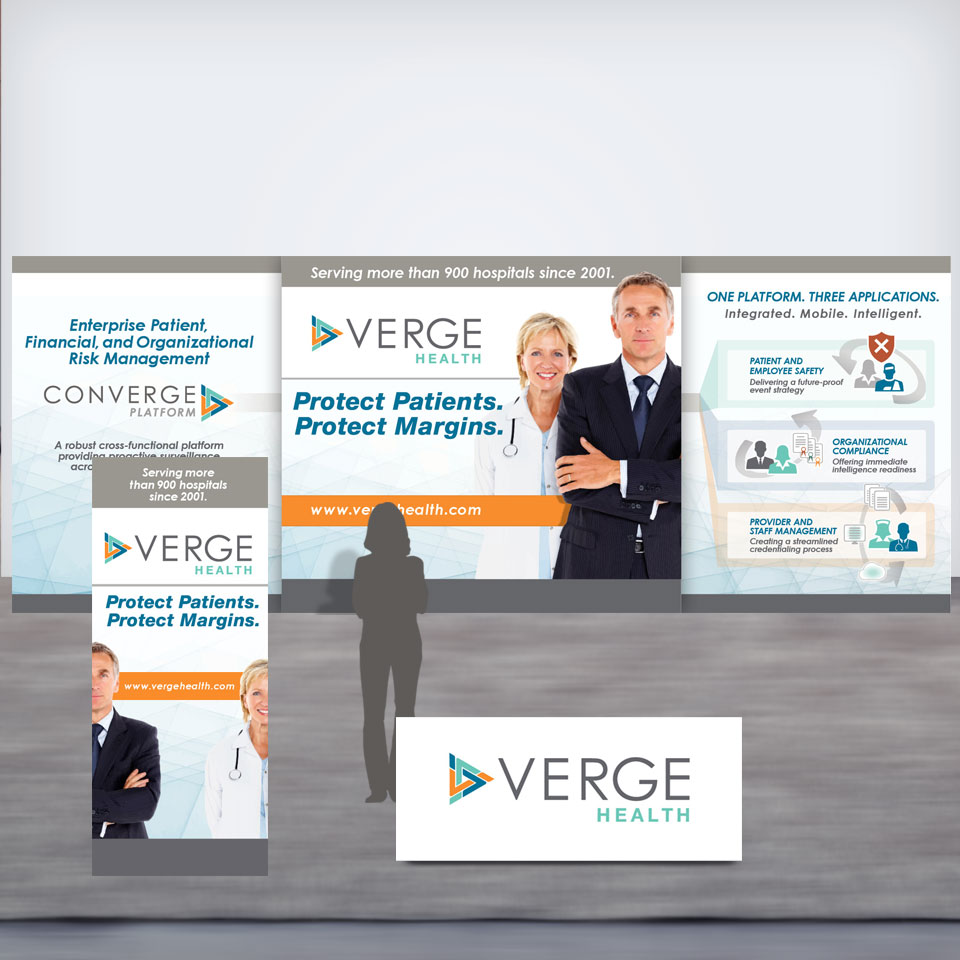
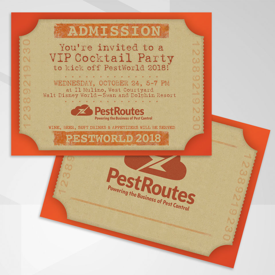
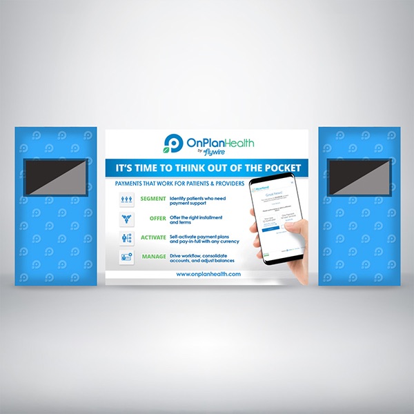
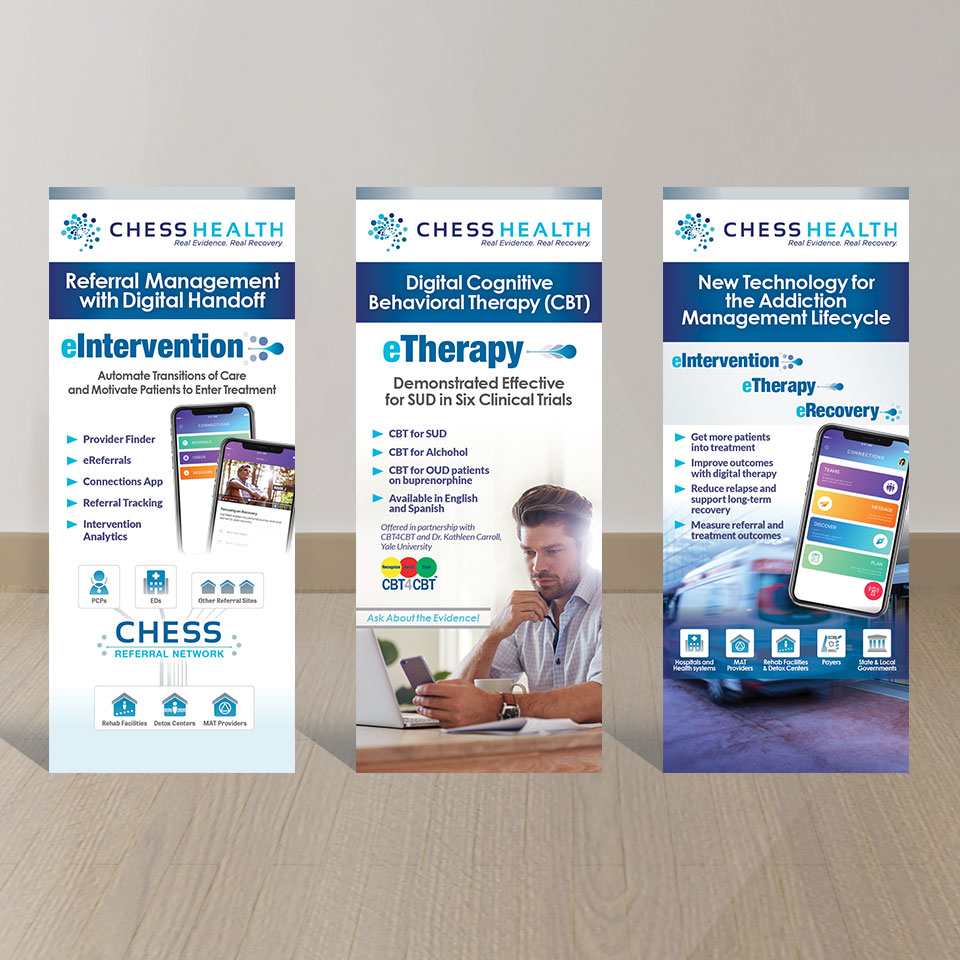
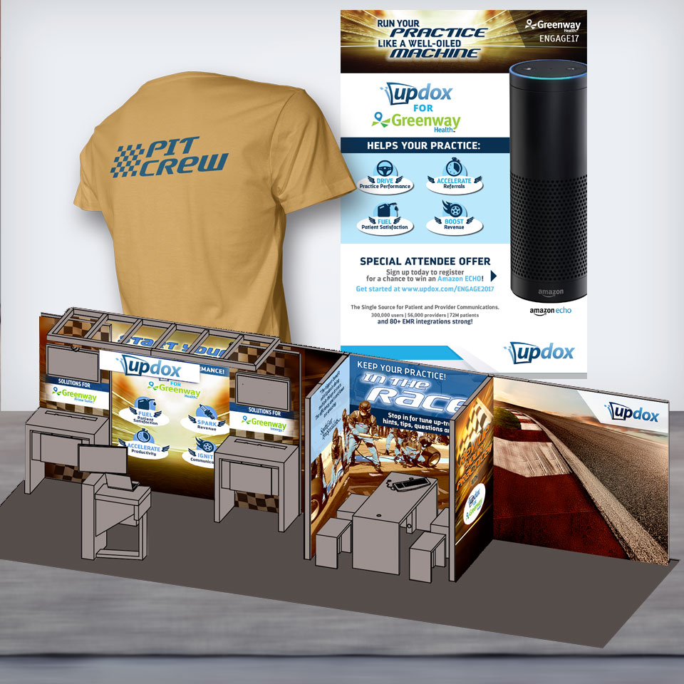
Trade shows are an important opportunity to promote a focused campaign that introduces and highlights your company’s headline product or service.
Depending upon the event, your needs might fall anywhere from just a simple web ad all the way to a comprehensive campaign that includes ads, vertical banners, backwalls, invitations, collateral handouts, branded merchandise, signage, and landing web page design and support, and more.
No matter the scenario, there are a lot of moving parts. Creating a cohesive and complementary campaign, maintaining your corporate identity, establishing a separate yet complementary trade show theme, and hand-holding each piece through its own unique production path should only be left to an experienced graphic designer / art directory. Trade show production is pricey and with all too common last-minutes deadlines, you can’t afford to do things twice.
Thomas McAuley has done it all with 30+ trade shows supported since 2013 to his credit.
CONTACT CMD


Recent Comments