
Billboard Design: Special graphic design considerations

At a glance, billboard design appears to be a seems simple task. But that is an illusion. And there are considerations unique to billboard design at every point in order to achieve that illusion of simplicity—while marketing, during design, and throughout production.
These facts apply to any designed piece:
- The time required to adequately take in a design—to comprehend its who, what, and how—is directly related to the design’s simplicity and logic of its layout; and,
- Viewers only act on what they take in.
Billboard design is especially vulnerable to this truth.
The Who, The What, And The How
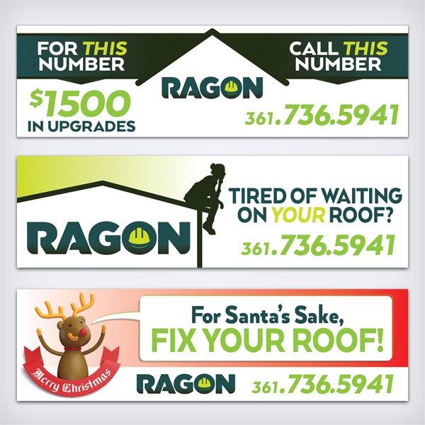
On average, viewers have 5 seconds or less to take in billboard details, so they must have ultra-simple designs—simpler in fact than business cards. A viewer can take in about three design elements in five seconds. These are almost always the company name/logo (the who), the message (the what), and the call-to-action (the how).
The Company Name/Logo
It’s beneficial to speak quickly about the importance of a clear, simple corporate logo design. If viewers spend half or more of their time deciphering all the layered detail of a complex logo, there’s little time to get to the other two important elements. They’d know who the client is, but miss the message or how to engage—the what and how.
The Message
All that billboard space can lead one into message bulk. “Well that’s part of my message, too.” “Seems like we have plenty of space for , too.” “How about we add…” are common requests, even understandable, but they should be seen for what they are: temptations into the Forest of Ineffective Design.
Imagine you have only 5 seconds of battery life to tell your rescuer how to save you. Would you ramble like an auctioneer, trying to get in as many details as you could quickly. Maybe, but you’d be wiser to include only a couple key details in as clear a fashion as possible. The same is true with billboard design. Rather than filling the space edge-to-edge with information, it’s wiser and more effective to limit the message to one thing whenever possible—one service, one special, a short pitch. And that one message should itself be ultra-short:
- Fun for the Whole Family
- Free Drink with Fill-Up
- Best Mexican in the County
- Next Stop 50 Miles
- Free Estimates. Always.
The Call-To-Action
The call-to-action is what the viewer needs to do to become a customer. Like the message, it needs to be singular and concise:
- Phone number
- Web address
- Exit 250 / 1 mile
- Stop In. Next Exit.
Since this unique ad space is expensive and because attempts are being made in every market nationwide to phase it out, let Company Man Design concept, design, and deliver your attention-getting, effective, and targeted billboard.