

Data Visualization Examples
App api
Below is an example of the creation and revision of an AI-assisted ad placement app featuring an animated data visualization of live analytics.
https://youtu.be/42uJvIMBNHU
When we integrated ad placement into a live event streaming OTT app I designed, we decided to leverage AI which would would sniff the chat stream for indicators of the best times to place advertisements. Advertisers would choose ad duration with a slider and click demographic categories. Those parameters together would result in an ad cost expressed in in-app currency.
Based on surveyed and observed user feedback, I modified the API button’s appearance and placement to better distinguish it from the chat button. I optimized the layout of the open panel, allowing for more demographic categories and the addition of an ad carousel for advertisers managing multiple ad campaigns. Last, I added a live analytics animation which tracked user views, clicks, and conversion rate.
This click-thru also shows an animated advertisement and its slide-out tray, offering users deals or advertiser-branded merchandise.
Complex processes
Below is a visualization used to simplify the concept of a client’s healthcare data science offerings. It illustrates the varied nature of raw data, its preparation of analysis, analytic insights, and its being served up in a visual, understandable presentation.

Visualizations to fit the data
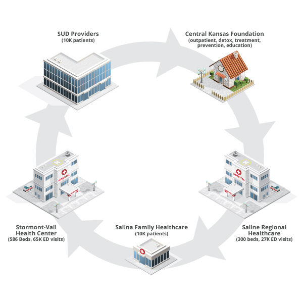
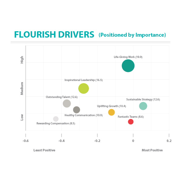
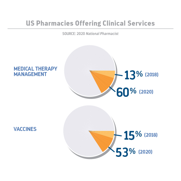
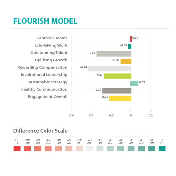
Below are further examples of data visualization for very different cases.


0 Comments