Your corporate logo is your company’s first impression to prospective clients and customers. First impressions are hard to overcome, and most of the time you won’t be there to try.
It is crucial that a seasoned pro with tons of branding experience leads you through the process. And that’s where I come in.
With more than 60 companies of all sizes branded and rebranded from the corporate logo design to everything that comes afterwards, you can trust that I know the pitfalls and opportunities presented in this very important time in a company’s evolution.
Contents
EVALUATING YOUR CURRENT CORPORATE LOGO
The first step is to detach as much as possible from any personal feelings or other connections you may have with your current corporate logo design, to look at it with new eyes, to look at it as much as possible like your clients and customers will be looking at it. If you’re unable to, try to ask a handful of strangers, people who don’t know you or the company, what their impressions are of the company that this logo represetnts.
Don’t lead them. Ask them things like, “How big do you think this company is?” “How long do you think this company has been in business?” “Is this a foreign or a domestic company?” “What business do you think this company is in?” and “Is this company still in business?” Some or all of their answers might shock you. Just try to go in expecting the worst, because most company logos can use improvement. You’re not alone.
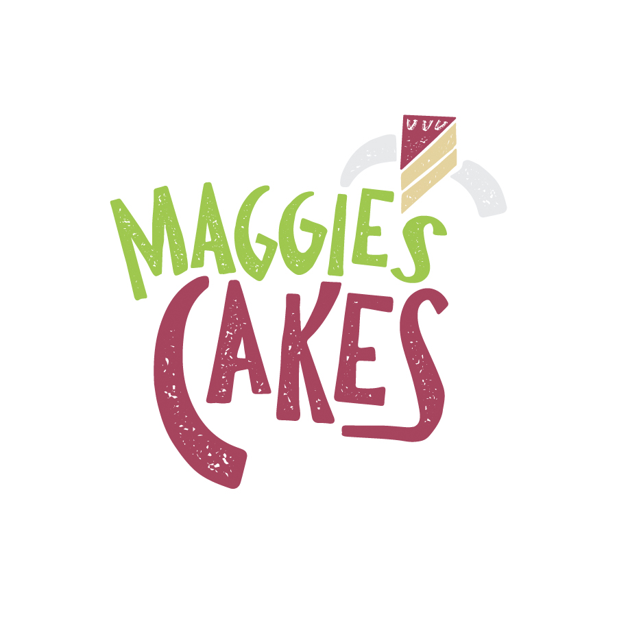
Not all of the logos below in my design portfolio tell specifically what each business does, but all of them tell a client or customer that there is a certain level of sophistication. They all impart a clear mood or tone of the company’s business. They all indicate that the companies are probably current, not decades old. And they all communicate a certain proficiency and confidence in what they do.
So now you’ve either seen it or seen it through strangers’ eyes and you understand it’s time for a change. But how can you transition your company into the next phase without that logo that’s meant so much to you?
Maybe you scratched it out on a napkin during a special, inspired moment when you were first starting out. Maybe your favorite niece was an artists and you were proud to let her create it. Maybe initially you didn’t have any money to do it right. Whatever the reason, you owe it to yourself to hold that old logo in your memory, but to move on. You, your employees, and your company’s success depends on it more than you can imagine.
YOUR CORPORATE LOGO’S REACH
In addition to being your company’s first impression, your corporate logo design has a wider reach than you might imagine.
Every design decision you will every make for your company, must relate in some way to the corporate logo, from the color of your trade show booth, to the orientation of your logo on vertical banners, how small it can appear at low resolution. It informs what your business cards look like, your sales sheets, your brick and mortar signage, your website, your app, your company vehicles, and a never-ending continuing list.
Additionally, your new corporate logo has the power to create whatever image in your clients’ or customers’ minds. If you’re a 10-person shop, an improved corporate logo can suggest that you could be a 100-person operation. What I try to do when creating a corporate logo is identify what the perfect business in your area of expertise would look like, what tone they would set, what reaction they are trying to elicit, and work from there.
Now Is Always time to evaluate your CORPORATE LOGO
So again, decouple your emotions from your current corporate logo. I’ll help you right your ship, using the wisdom and guidance I’ve gained over my years as a a professional designer who has done this hugely important work successfully dozens of times before.
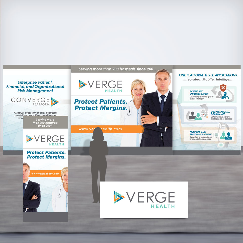
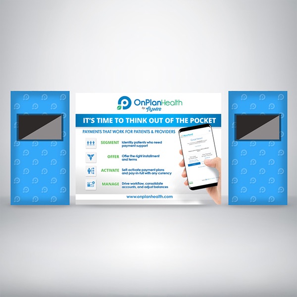
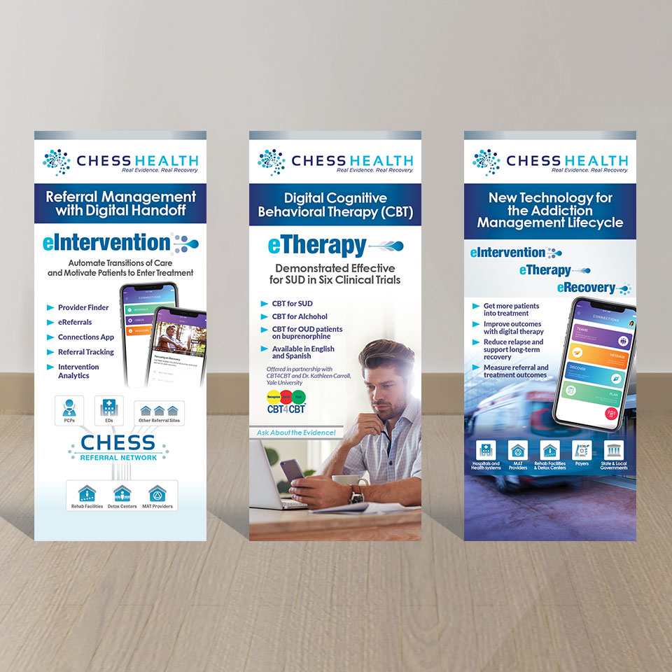
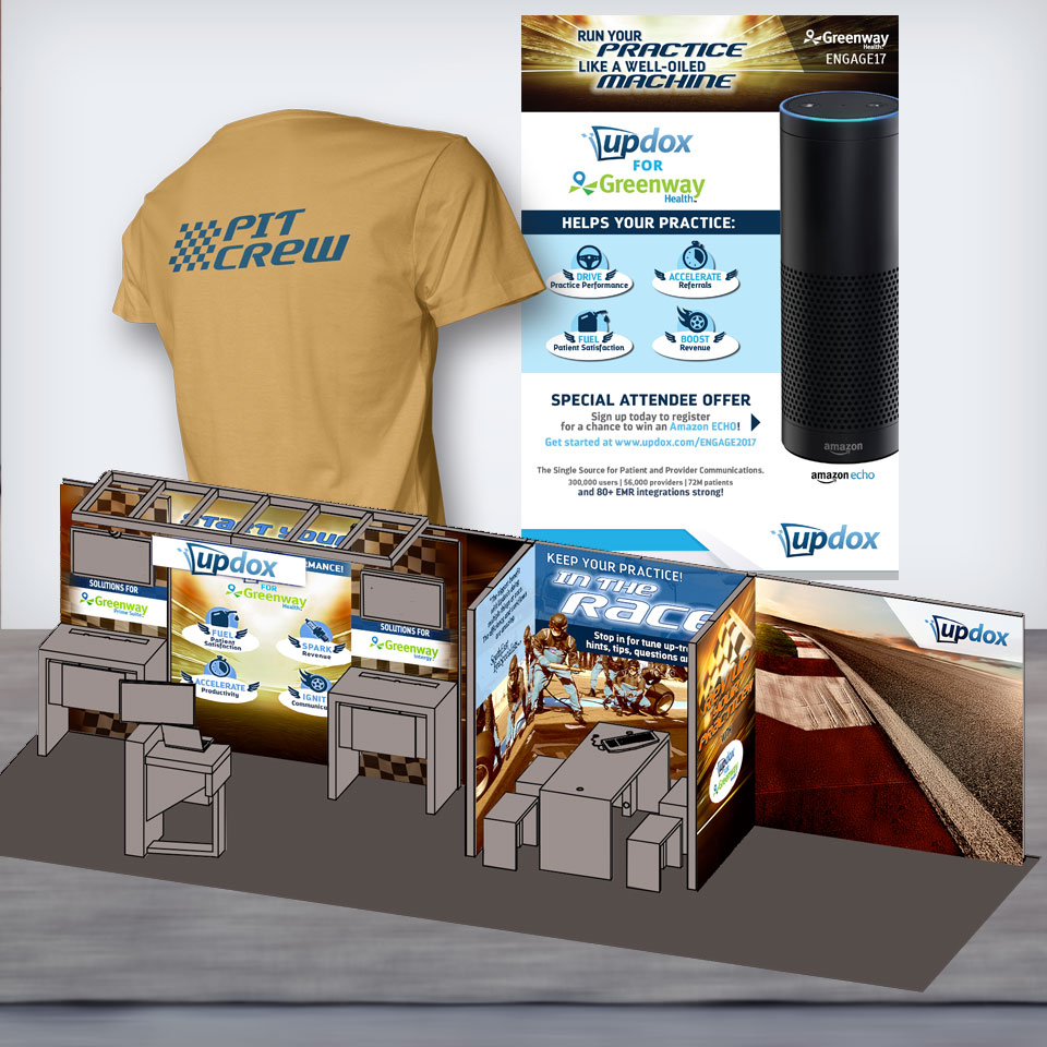
Trade shows are an important opportunity to promote a focused campaign that introduces and highlights your company’s headline product or service.
Depending upon the event, your needs might fall anywhere from just a simple web ad all the way to a comprehensive campaign that includes ads, vertical banners, backwalls, invitations, collateral handouts, branded merchandise, signage, and landing web page design and support, and more.
No matter the scenario, there are a lot of moving parts. Creating a cohesive and complementary campaign, maintaining your corporate identity, establishing a separate yet complementary trade show theme, and hand-holding each piece through its own unique production path should only be left to an experienced graphic designer / art directory. Trade show production is pricey and with all too common last-minutes deadlines, you can’t afford to do things twice.
Thomas McAuley has done it all with 30+ trade shows supported since 2013 to his credit.
CONTACT CMD
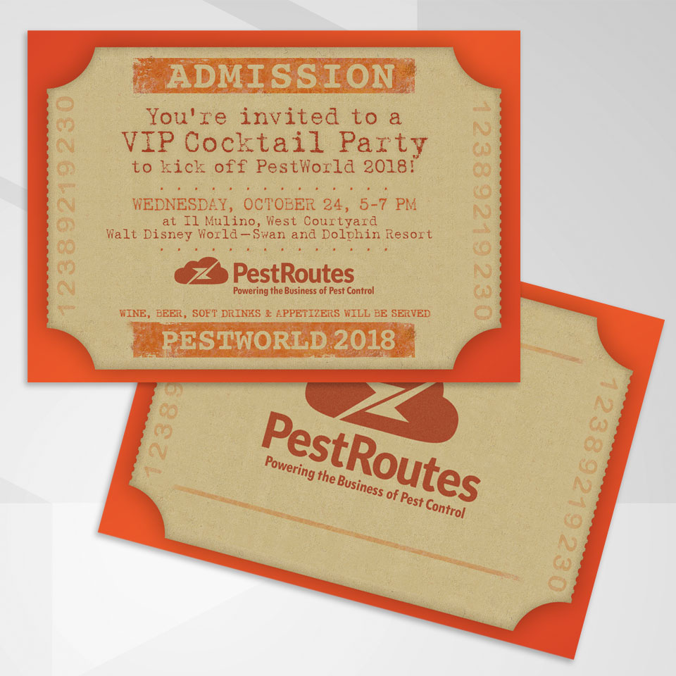
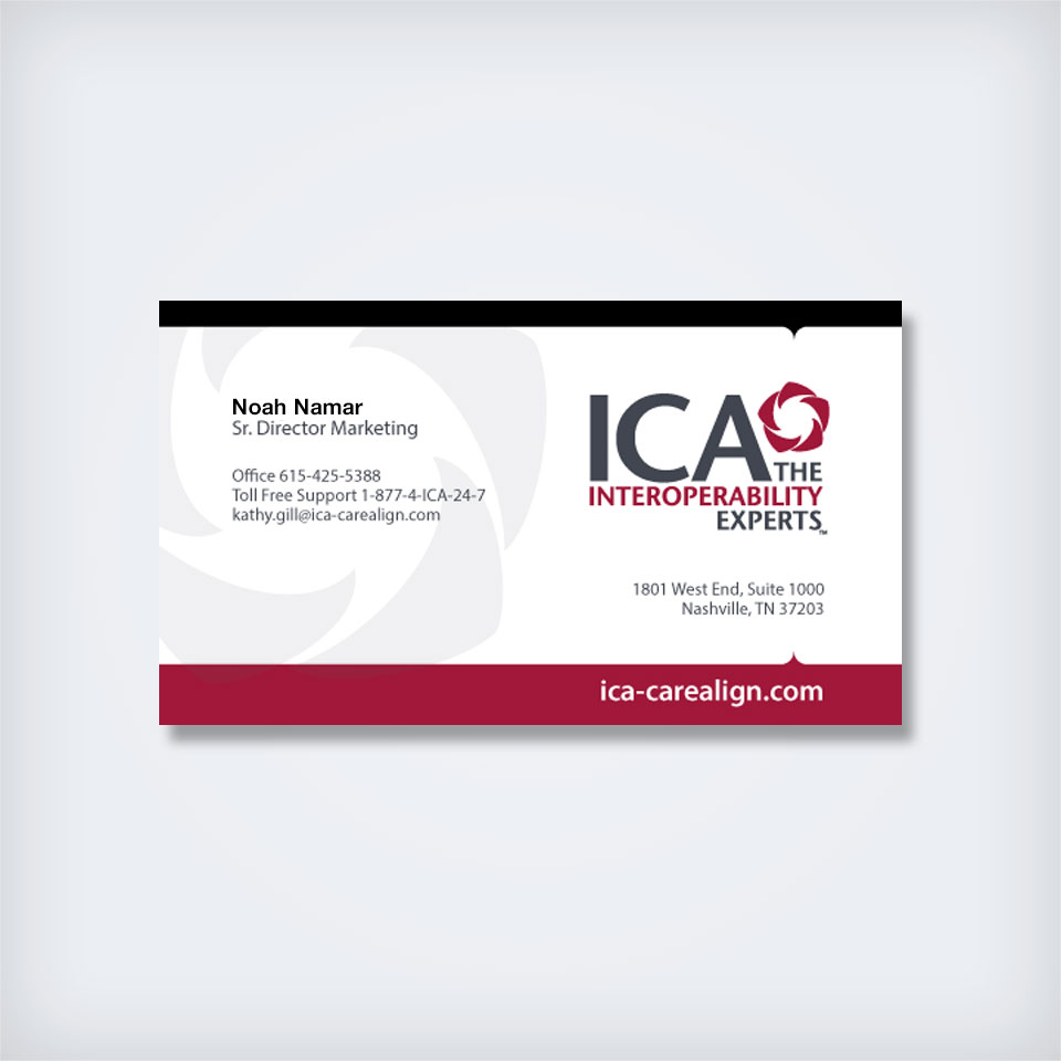
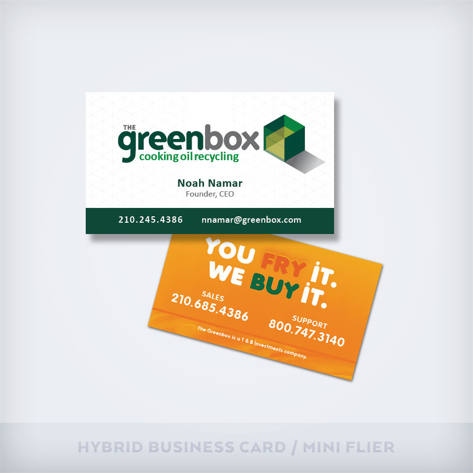
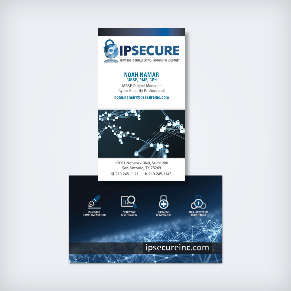
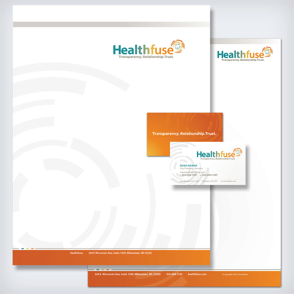
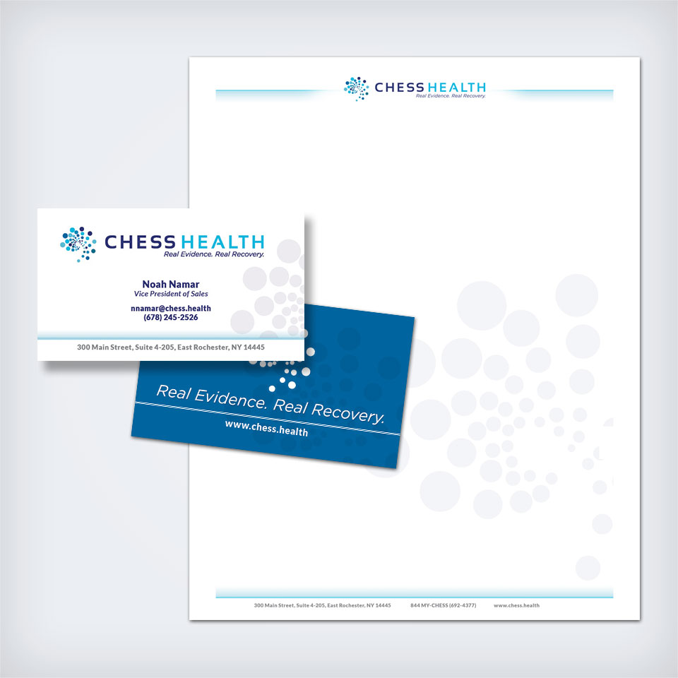
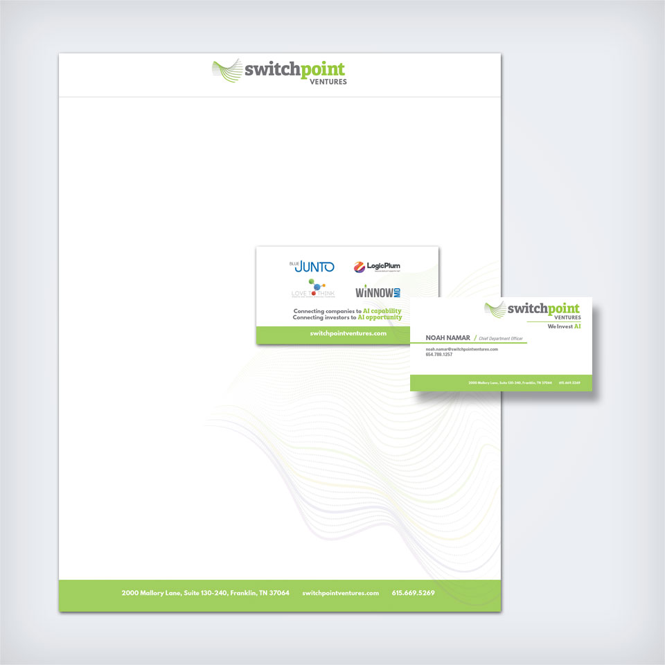
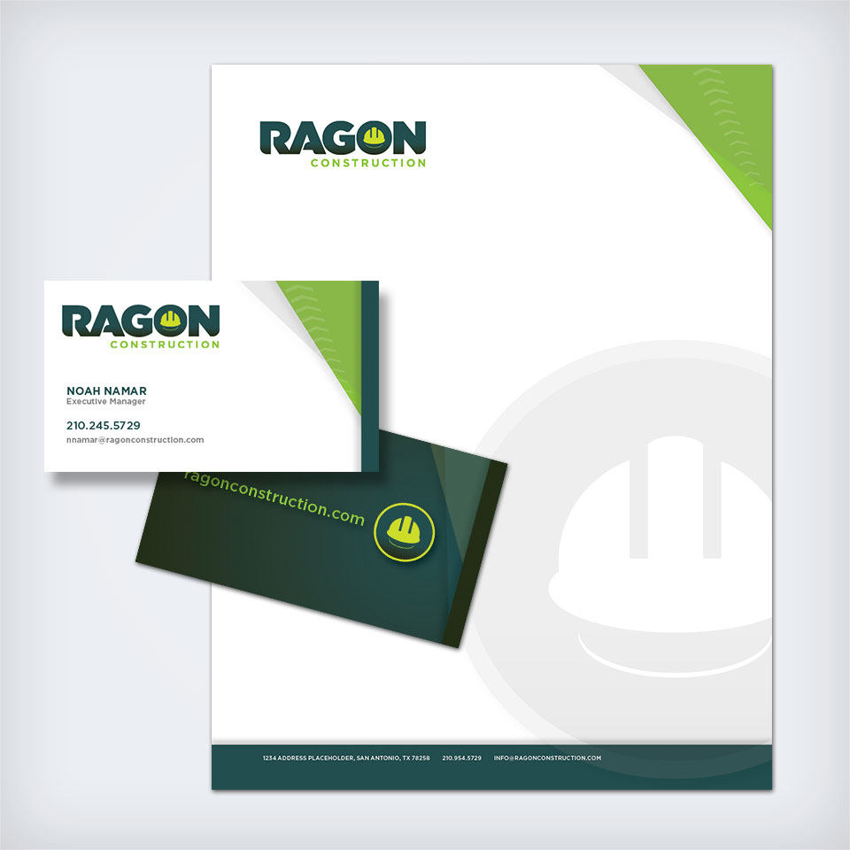
In this digital world, one might expect printed anything to be passé at best, if not outright obsolete. But printed stationery design is still a not only a thing: it’s a necessity. Digital stationery isn’t a replacement but an addition to an individual’s or a company’s list of corporate identity needs. I have branded and rebranded 50+ large and small organizations nationwide, including full print and digital stationery.
Billboard Design: Special graphic design considerations
At a glance, billboard design appears to be a seems simple task. But that is an illusion. And there are considerations unique to billboard design at every point in order to achieve that illusion of simplicity—while marketing, during design, and throughout production.
These facts apply to any designed piece:
The time required to adequately take in a design—to comprehend its who, what, and how—is directly related to the design’s simplicity and logic of its layout; and,
Viewers only act on what they take in.
Billboard design is especially vulnerable to this truth.
The Who, The What, And The How
On average, viewers have 5 seconds or less to take in billboard details, so they must have ultra-simple designs—simpler in fact than business cards. A viewer can take in about three design elements in five seconds. These are almost always the company name/logo (the who), the message (the what), and the call-to-action (the how).
The Company Name/Logo
It’s beneficial to speak quickly about the importance of a clear, simple corporate logo design. If viewers spend half or more of their time deciphering all the layered detail of a complex logo, there’s little time to get to the other two important elements. They’d know who the client is, but miss the message or how to engage—the what and how.
The Message
All that billboard space can lead one into message bulk. “Well that’s part of my message, too.” “Seems like we have plenty of space for , too.” “How about we add…” are common requests, even understandable, but they should be seen for what they are: temptations into the Forest of Ineffective Design.
Imagine you have only 5 seconds of battery life to tell your rescuer how to save you. Would you ramble like an auctioneer, trying to get in as many details as you could quickly. Maybe, but you’d be wiser to include only a couple key details in as clear a fashion as possible. The same is true with billboard design. Rather than filling the space edge-to-edge with information, it’s wiser and more effective to limit the message to one thing whenever possible—one service, one special, a short pitch. And that one message should itself be ultra-short:
Fun for the Whole Family
Free Drink with Fill-Up
Best Mexican in the County
Next Stop 50 Miles
Free Estimates. Always.
The Call-To-Action
The call-to-action is what the viewer needs to do to become a customer. Like the message, it needs to be singular and concise:
Phone number
Web address
Exit 250 / 1 mile
Stop In. Next Exit.
Since this unique ad space is expensive and because attempts are being made in every market nationwide to phase it out, let Company Man Design concept, design, and deliver your attention-getting, effective, and targeted billboard.
Environmental Design encompasses any design that connects people to places, including everything from graphic design to architecture to landscape. However, at Company Man Design, we’re concerned with the graphical side of things, such as interior and exterior signage and signage systems, to design and art intended to both decorate and impart information in an organization’s place of business.
Signage and Signage Systems
Signage and signage systems may seem like a simple affair. But because much of it works well in our lives, we may find that we take it all for granted. But undertaking signage is not only expensive from a production standpoint but it is also surprisingly complex—external, internal, directional, fixed, moveable, static, changeable, print, digital, fabricated, etc. Then one must consider the specifics of human interaction—viewer distance, time exposed, language, symbology. Then there is corporate identity. And more. Let CMD guide you through this complex landscape.
Wall Art
Businesses have the option of designing their interior and exterior wall space to include anything from fine art to informative posters to inspirational quotes and more. Let CMD help you get the most out of the spaces around you whether you’re wanting a calm, inspirational, informative, or mixed work environment.
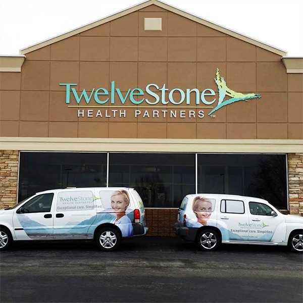
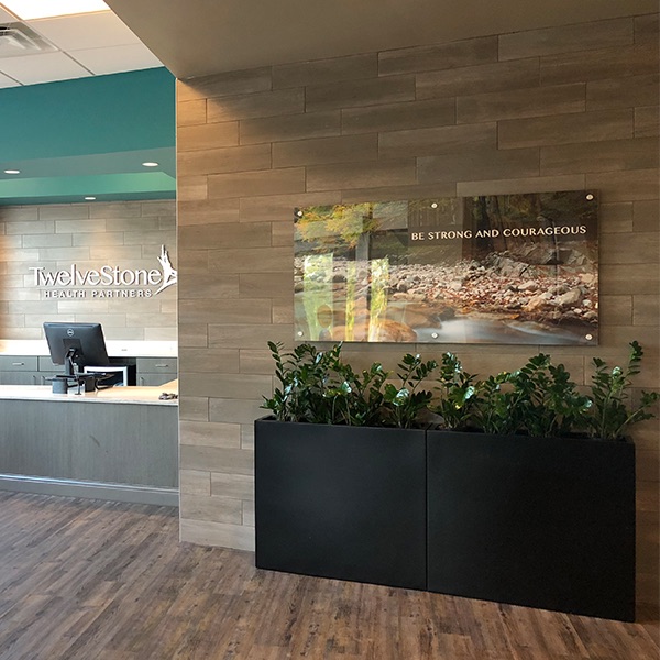
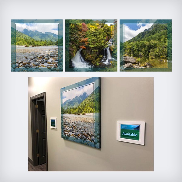
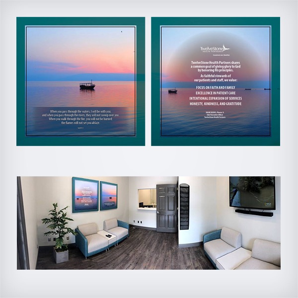
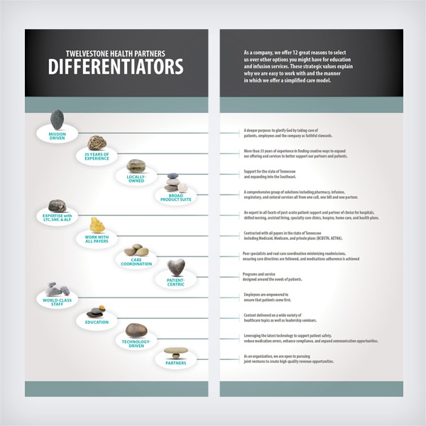
CASE STUDY: TWELVESTONE HEALTH PARTNERS
Tennessee-based TwelveStone Health Partners‘ needed exterior signage, digital signage for their infusion suites, and decorative and informative wall art to fill out their Murfreesboro and Chattanooga locations’ interior spaces. We provided them a cohesive set of signage and artwork that maintained the strong corporate identity we had helped create for them in 2015. We are proud to continue to work with them regularly today.


Recent Comments